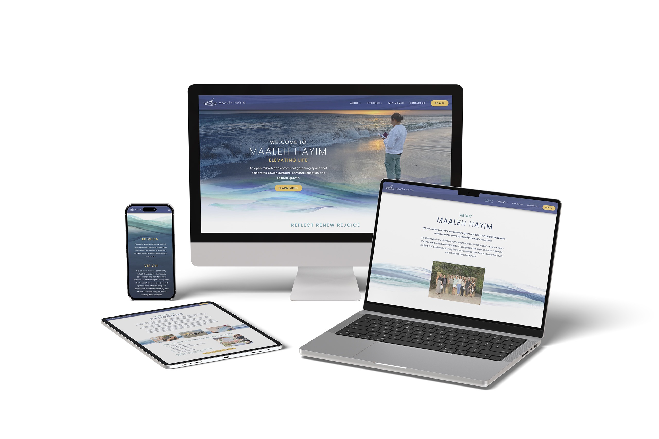
Maaleh Hayim approached us with a beautiful concept and a clear vision, but needed guidance on how to bring their idea to life. Although they didn’t yet have a brick-and-mortar location, they required a strong logo and a cohesive brand identity that could scale and grow with them over time. Through a collaborative process exploring various colors, textures, and styles, we developed their defining visual identity. The final logo elegantly merges the letters “MH” into flowing water, symbolizing the profound act of immersion into a mikvah. We are incredibly proud to have helped build the foundation for this meaningful brand.
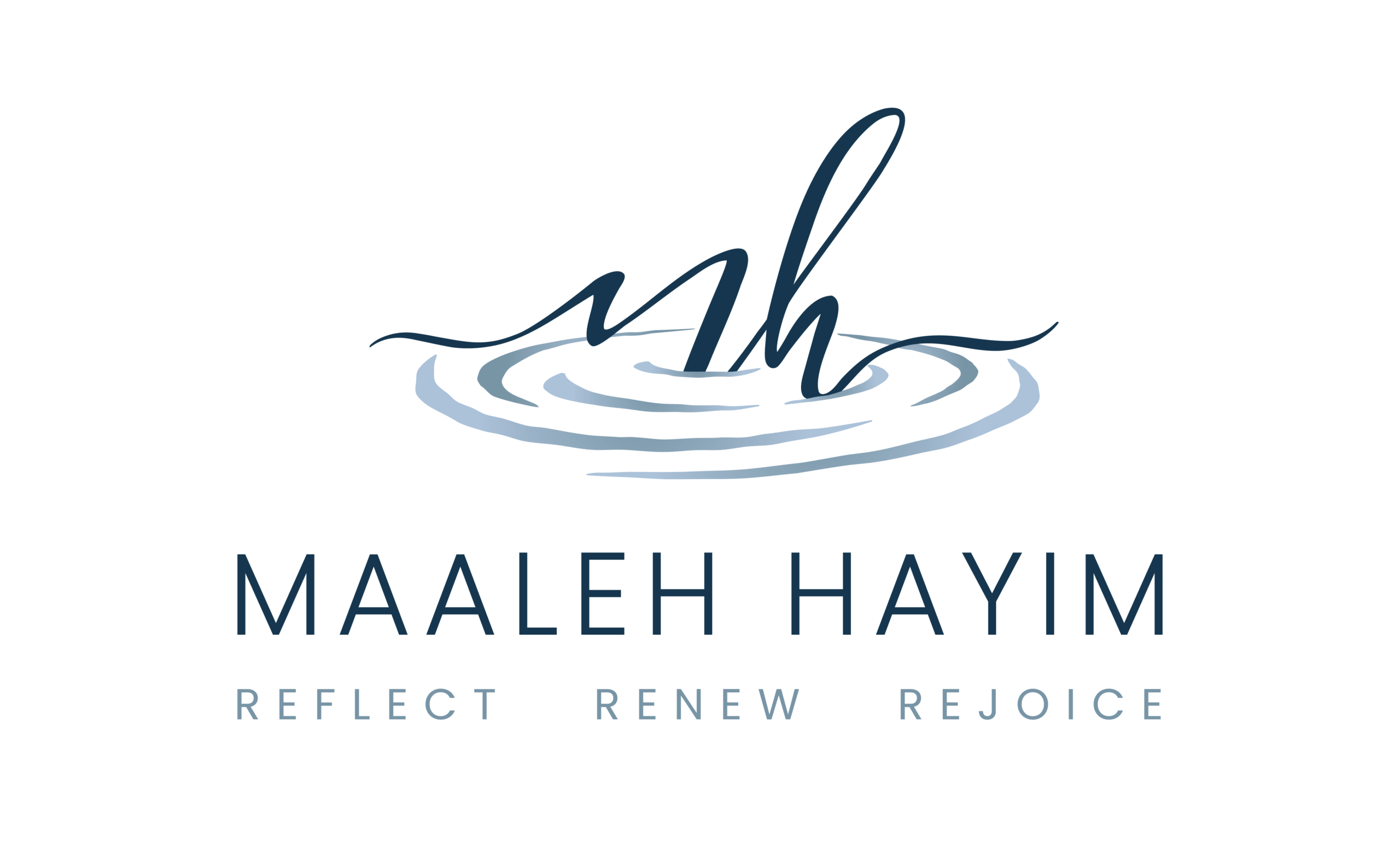
New Logo After The Refinement
Harmony Design has been my go to for the last 5 years. Annie and her team have created logos that reflect our mission and purpose. Their marketing materials are thoughtful and clearly and creatively convey the message of the client. I highly recommend Harmony design for any marketing project.
 Cassie Weinstock