About the Broken Crayons Podcast
Broken Crayons is an interview-style podcast hosted by LA-based comedian, writer, actor, and artist Maddi Mays.
Each episode features a special guest from Maddi’s world. The format is simple: Maddi and her guests chat, laugh, doodle, and co-create a piece of art together on a shared canvas.
As artists and designers ourselves, we love how Broken Crayons uses candid conversations to blend creativity with comedy. And after listening to just a few episodes, we knew it would be a blast to work with Maddi and her team.
The Challenge: More Guests, More Buzz, and a Brand Identity that Needed to Level Up
As Maddi’s career as a stand-up comedian began to grow, the Broken Crayons podcast also started gaining traction with bigger-name guests and high-level sponsorship opportunities. It soon became obvious to the Broken Crayons team that if they wanted to keep up with this growth, they needed to level up the podcast’s brand identity, which would allow them to put their very best foot forward in front of sponsors, potential guests, and new audiences.
The Broken Crayons podcast already had a solid logo (that Maddi designed herself), but the production team did not have the time or bandwidth to create the full suite of professional visual elements and assets necessary to take the podcast to the next level.
After meeting with the Broken Crayons team, we identified three key areas in need of improvement:
- Sponsor Slide Deck
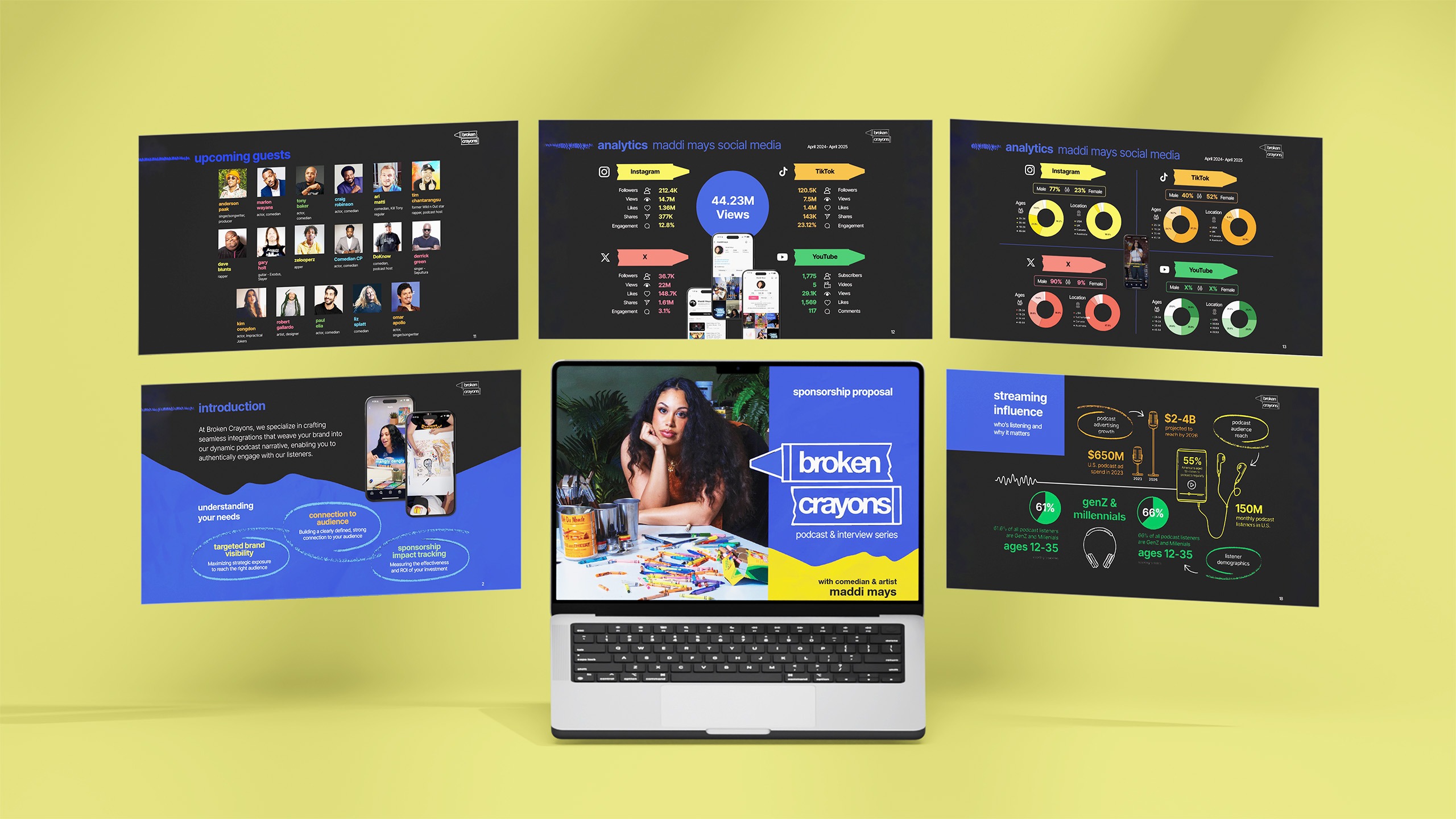
Without a professional-grade slide deck, the Broken Crayons podcast was unable to start pitching for sponsors. It was really important for Broken Crayons to be taken seriously from the get-go, and they knew they needed a pitch deck that was professional, easy to understand, and fully reflective of Maddi’s personality, perspective, and sense of humor as a comedian. - Website
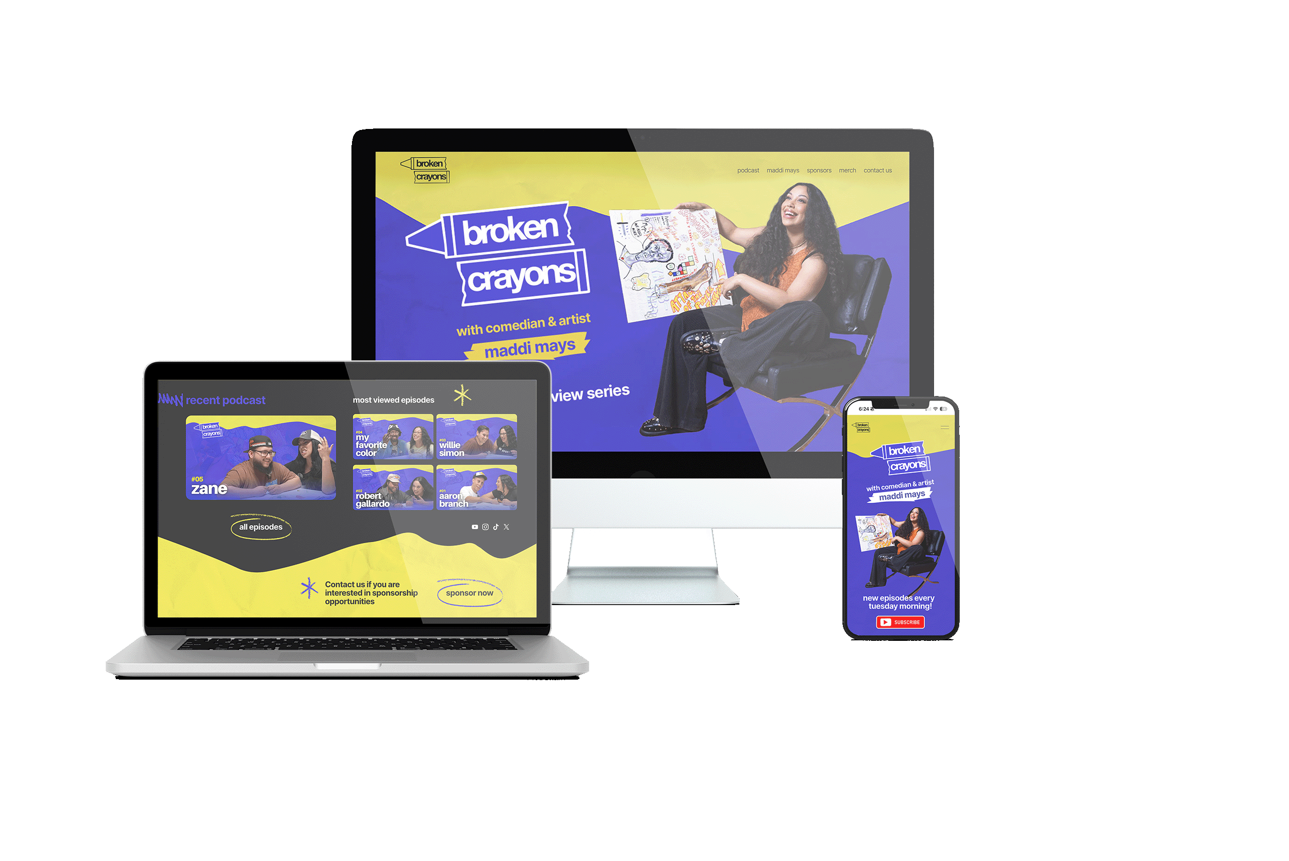
The Broken Crayons podcast already had a logo, YouTube channel, and some photos from a professional photoshoot. But there wasn’t a website to bring it all together. A website was crucial for showcasing the podcast in a cohesive way, giving potential sponsors, guests, and listeners a place to learn more about the podcast and get involved. - Visual Asset Development
It was also clear that in order to create a polished, professional-grade visual identity, Broken Crayons needed some creative building blocks — such as illustrations, iconography, branded elements, color palettes, textures, and typography. These final details would really help the podcast go beyond the logo, bringing the brand to life across platforms and formats.
It’s clear the Broken Crayons team already has plenty of talent, vision, and momentum… but to really turn up the volume, they also needed a trusted creative partner to take the reins, make recommendations, and own the visual development and design process from start to finish.
Our Solution: Turning Creative Vision into Sustainable Design Concepts and Assets
We kicked things off by redesigning the cover of the sponsorship pitch deck. We leaned into their preference for the Helvetica font, but elevated this approach with cleaner, more refined type choices. They also really wanted to use primary colors with color blocking, so we made sure to base our designs on this creative vision.
To reflect Broken Crayons’ playful outlook, we avoided anything too rigid or overly structured. Instead, we brought in some fluidity with different angles and options for taking ideas in different directions.
Out of all the options we sent over, we landed on the following pitch deck cover.

This cover served as the initial concept to build out the rest of the designs and assets, which included:
- Variations of the logo, including a version that illuminates the logo as a neon sign (like the sign in the background of each episode).
- Variations of the crayon, including different edges and textures.
- Color palette, bringing in a secondary palette to elevate the existing colors and taking inspiration from a box of crayons.
- Textures, incorporating textures that feel grungy and authentic, emulating an art gallery in a concrete space where color pops off the wall.
- Illustrations, such as scribbles and icons, to build up the asset library.
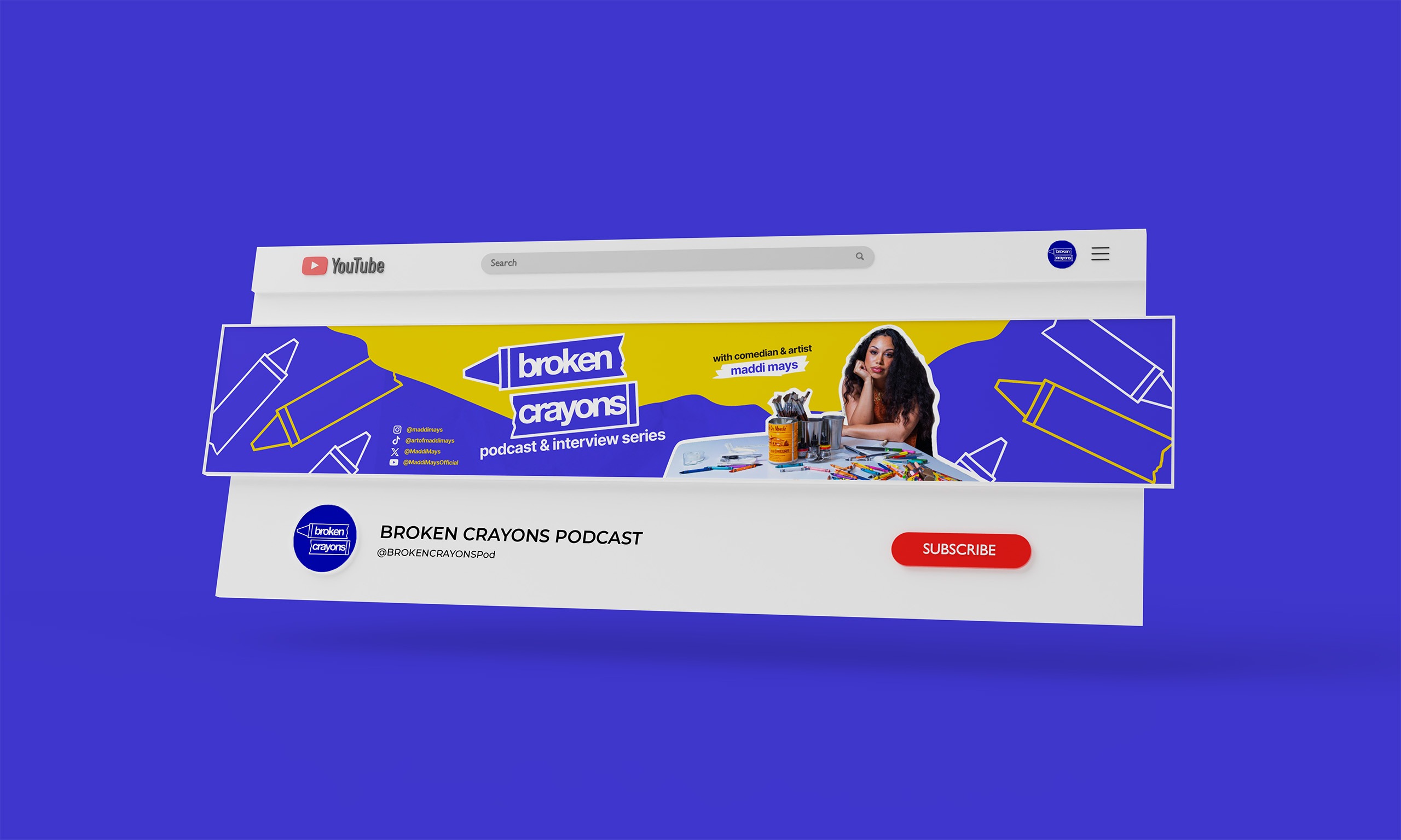
Once all the visual elements were approved, we then collaborated closely with Broken Crayons to build out the sponsorship pitch deck, website, YouTube cover graphic, and branded documents for guests.
Here’s a behind-the-scenes look at how our services supported the creative process.
- Graphic Design and Visual Storytelling. Our goal was to make the sponsorship deck feel clear, compelling, and unmistakably Broken Crayons. We refined the content, used newly created visual elements to highlight relevant stats for sponsors, and integrated mockups to show exactly what the podcast looks like on phones and streaming platforms. We wanted to really take things up a notch, presenting Broken Crayons as a podcast that is bright, fun, and professional.
- Brand Identity Development. To develop the Broken Crayons brand identity, we drew from themes surrounding who Maddi is, who her guests are, and what the podcast is all about. This allowed us to create a brand identity that really matched the energy of the show and stayed true to Maddi’s sense of humor and artistry.
- Creative Direction and Art Leadership. Broken Crayons came to us with strong ideas and a solid logo to work with. We helped them take their ideas to the next level, providing advice on how to build a cohesive visual system that can grow as the podcast grows.
- Photo Retouching and Editing. We enhanced the neon signage, created photo cutouts, expanded pictures from Maddi’s photoshoot, and created lots of different mockups to showcase what the podcast looks like in action when streamed on different devices and platforms.
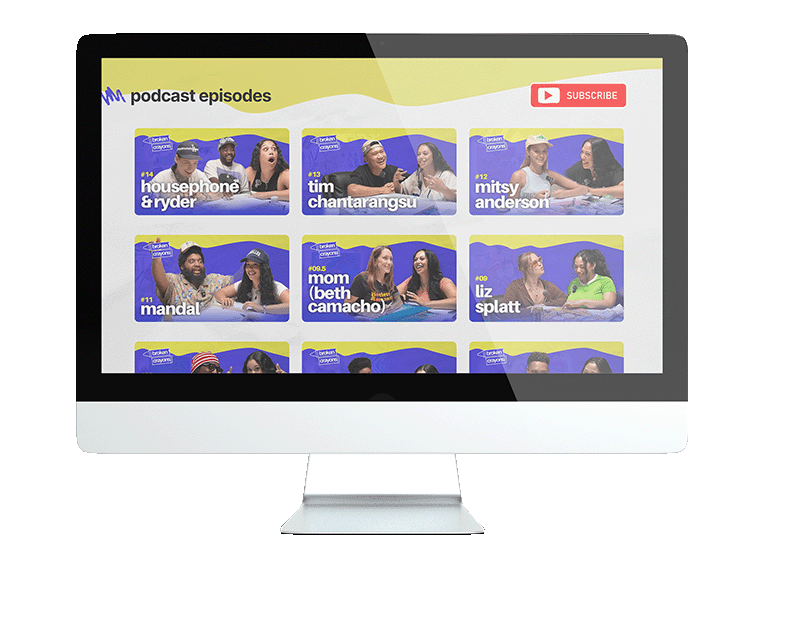
- Website Design and Development. We designed and built a Squarespace website that was simple, easy to navigate, and consistent with all the other visual elements we created in terms of colors, textures, movement, and sketches. We really wanted the website to be easy for visitors to watch previous episodes, subscribe to the podcast, and learn more about who Maddi is. We also wanted to create a place for sponsors to reach out.
For our team, this project was pure creative joy. We loved working with the bold colors, and connecting design to comedy is not something we get to do every day.
The whole point of the Broken Crayons podcast is to have fun, draw, and be creative, not to mention it was a pleasure to get to infuse these themes into each step of the design process.


The Results: A Solid Foundation for Growth
With a comprehensive brand identity, a polished (but fun!) sponsorship deck, and a colorful, user-friendly website in place, the Broken Crayons podcast now has everything it needs to:
- Pitch to sponsors with confidence
- Book high-profile guests
- Reach new listeners
Since working together, Maddi and the Broken Crayons team are super happy with the impact the new brand identity has had on momentum, with the YouTube channel continuing to grow by around 1,000 views and subscribers each week. Maddi has also received a ton of positive feedback from fellow comedians and industry experts, and the team continues to secure more high-profile guests.
Most importantly, though, the Broken Crayons podcast now has the visual structure and flexibility it needs to grow, evolve, and scale.


